.png)
Why Pantone’s Color of the Year Matters to Everyone – Not Just Fashionistas
- Feb 16, 2025
- 4 min read
Have you ever noticed how the color of the year seems to pop up everywhere? From fashion runways to interior design, to even the products you’re using—Pantone’s Color of the Year is more than just a seasonal trend. It’s a cultural marker that captures the essence of the time we’re living in.
But how do they choose it? Why should it matter to you, even if you don’t work in design? Let’s dive into what makes Pantone’s Color of the Year such a big deal.

So, What Exactly is Pantone's Color of the Year?
Pantone, the company that’s essentially the gold standard for color matching, has been choosing a “Color of the Year” since 1999. Initially, it started as an educational initiative to spark conversations about the connection between culture and color. Now, it’s a globally recognized event that gets designers, marketers, and color enthusiasts talking.
Each year, Pantone’s team looks at the world’s macro trends. They’re not just guessing what color might be popular next season; instead, they’re predicting how cultural events, social movements, technology, and even socio-economic conditions will shape the world’s aesthetic in the coming year. It’s about identifying a color that reflects the global mood.

How Do They Pick It?
Pantone’s Color of the Year isn’t chosen lightly. It’s the result of months of research and discussions. The Pantone Color Institute has a global team of experts—think color anthropologists—who travel the world, gathering inspiration from everything around them: films, art, fashion, technology, social media, even travel destinations. Their goal? To find a color that represents the year ahead.
In fact, selecting the color is a continual conversation that spans throughout the year. It's not like they all sit in a room one day and decide. It’s more of an evolving process, influenced by everything from the latest fashion trends to the rise of new technologies and even the latest political climate.

Why Does It Matter to Everyone?
You might be thinking, “Okay, but I’m not a designer or fashionista, why should I care about Pantone’s Color of the Year?” The answer is simple: color influences everything.
From the clothes you wear to the spaces you inhabit, color has a huge psychological impact. Pantone's annual color selection can shape everything from the way we feel to the way we make purchasing decisions. That’s because colors are directly tied to emotions—think of how a bright yellow might make you feel cheerful or how a deep blue can evoke calmness.
For businesses, Pantone’s Color of the Year is a powerful tool. When Pantone picks a color, it often sets the tone for product development, branding, and marketing strategies. Companies, from car manufacturers to tech brands, leverage this color to connect with consumers on an emotional level. The color selected is meant to be a reflection of what people need or desire at that specific moment in time. It’s about creating a visual language that resonates with consumers across the globe.

It’s Bigger Than Just Fashion
While Pantone’s Color of the Year definitely gets a lot of love from fashion designers and interior decorators, its reach goes far beyond those industries. Have you noticed how the color pops up in unexpected places? Whether it's in the packaging of your favorite snack or the design of the latest tech gadget, color trends play a huge role in how products are marketed.
Even the entertainment industry isn't immune. Think of how colors like Ultra Violet (2018) or Living Coral (2019) were used in everything from movie sets to costume designs, creating a cohesive visual aesthetic that complemented the mood of the time.
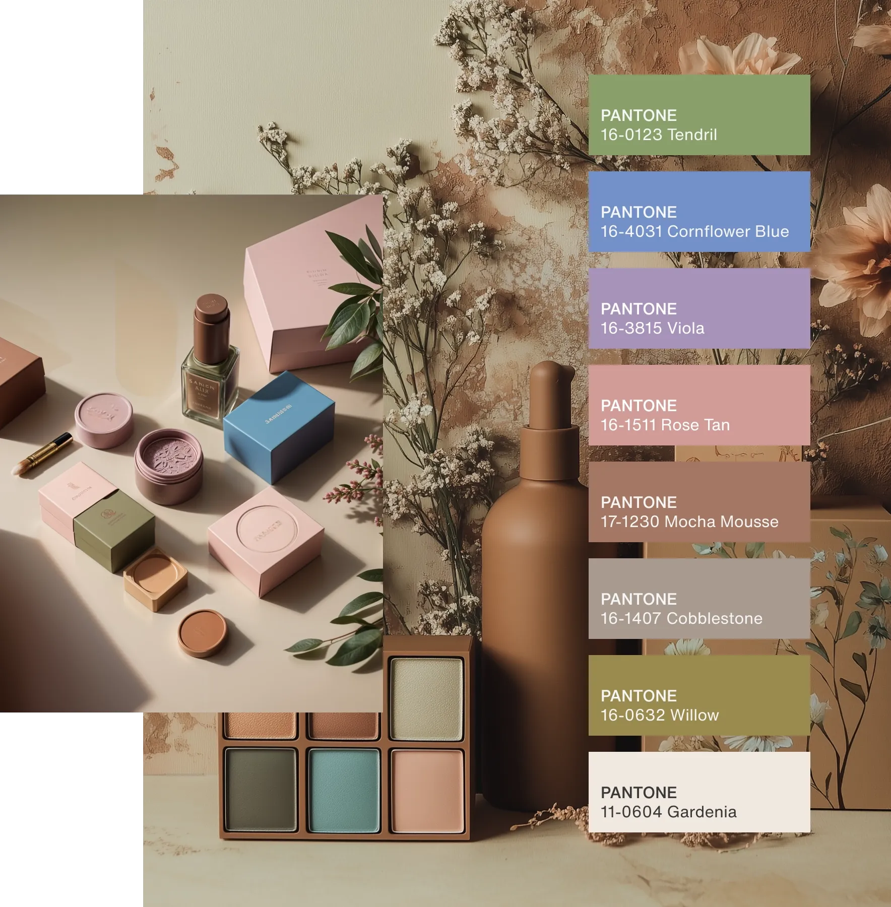
In fact, the 2025 color, Mocha Mousse, the first-ever brown chosen, is all about the warmth and comfort people crave in a post-pandemic world. It’s a color that evokes feelings of indulgence, bringing a sense of calm amidst the chaos. When you see Mocha Mousse on a product or in a design, it’s not just a color choice—it’s a direct reflection of what we need in this moment.

Color and Culture: A Snapshot of Our Time
At its core, Pantone’s Color of the Year is a snapshot of our culture. It’s more than just a prediction; it’s a response to what’s happening globally. In 2023, Viva Magenta was chosen because it represented vibrancy and vigor at a time when people were craving optimism and a shift from post-pandemic uncertainty. Similarly, this year’s selection of Mocha Mousse is meant to soothe, providing comfort in the form of a rich, indulgent brown.
When Pantone picks a color, they aren’t just making a design choice—they’re highlighting a global trend, tapping into the collective psyche of people around the world. It's a way to visually represent the cultural currents shaping our lives.


Final Thoughts
So next time you see Pantone’s Color of the Year in your favorite store or on your social media feed, remember that it’s not just another trend. It’s a cultural conversation. The color represents what people are feeling, needing, and desiring as we move into the future. It’s a tool that designers, marketers, and companies across industries use to connect with us in a meaningful way.
Whether you’re into fashion, interior design, or simply love the way color makes you feel, Pantone’s Color of the Year is something that matters to us all. After all, color speaks a universal language.


Comments