.png)
Bright or Subtle? Predicting the AW25/26 Color Trends for the Season's Palette
- Feb 17, 2025
- 4 min read
So, I don’t know about you, but I’ve already started daydreaming about what next fall and winter will bring to our slow--fashion closet. The experts over at Fashion Snoops, Hallie Spradlin and Joanne Thomas, have just dropped some seriously exciting color predictions for AW25/26, according to FashionUnited.uk.
Think bold, fresh, and, most importantly, adventurous. If 2025's fashion season was a dinner menu, these color palettes would be the main course—full of bold flavors, comfort, and a dash of nostalgia.


Spicy, Bold, and Full of Flavor
Let’s kick things off with a palette that’s so flavorful—literally. Inspired by the culinary world, the "Savory Brights" collection takes us on a wild ride of spicy reds and zesty yellows. Ever tried chili oil or soy sauce? Now imagine those hues splashing across your fall wardrobe. Colors like Chilli Oil, Lime Zest, and Soy Sauce make you think of bold, sizzling flavors on your plate. It's a vibrant mix that challenges your senses, offering an unexpected punch that’s not for the faint-hearted. And if you’re into purple berry tones, you’ll love Jupiter, a deep purple making waves in 2025’s summer and winter collections.
The showstopper here is Urgent Orange—this intense shade brings the fire and gives major groovy 60s vibes, like something out of a Paco Rabanne or Sonia Rykiel show. It’s all about embracing innovation and new beginnings. This palette isn’t afraid to push boundaries, making it a natural extension of previous seasons' experimental vibes. It’s like exploring a whole new world, with materials and designs that feel futuristic and ready for the next step in fashion evolution.


Timeless and Luxurious
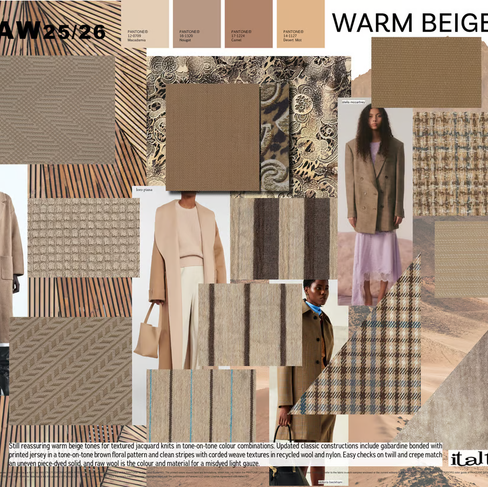
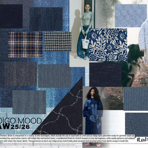
Switching gears to something a little more understated, we have the Practical Neutrals palette. This one is about staying grounded with classic, long-lasting shades that emphasize sophistication and sustainability. Think rich, muted colors like Sophisticated Sage, Brown Butter, and Crisp Navy, paired with Putty Beige for that quiet luxury vibe. These colors are the foundation of an investment wardrobe, designed to last beyond a single season. The anchor here is Puddle—a “greige” that’s all about versatility and timelessness.
In terms of materials, we’re talking cozy brushed wool, denim, and sleek, sustainable leather. This palette is about making mindful choices and opting for pieces that age gracefully. The designs to pair with these shades are elegant but built to last. If you're into “sensible minimalism” and want your wardrobe to reflect purpose and aesthetics, this is definitely the way to go.


A Nod to Nature
For those of us who love a more earthy, organic feel, Artisanal Midtones is a color palette that feels like a breath of fresh air. Inspired by nature, this collection leans into earthy tones like Sulphur (a vibrant yellow), Olive Terrain, Mineral Blue, and Natural Teal. These colors feel like something you’d find on a remote coastline, faded and weathered by the elements. They bring to mind an earthy sense of peace and connection with the natural world.
The star of this palette is Suncloud, a soft, radiant yellow that symbolizes optimism and renewal. It’s a shout-out to those natural dyeing techniques and eco-friendly practices that are gaining traction in today’s fashion scene. From organic cotton blends to raffia and ceramics, the materials that pair with these colors celebrate contemporary craftsmanship mixed with traditional, eco-conscious methods.

Key Color Trends for AW25/26 from WGSN & Coloro
If that wasn't enough, WGSN and Coloro—two big players in trend forecasting—have also revealed some key colors for AW25/26. These shades go hand-in-hand with the themes of urgency, change, and optimism. The standout colors include:
Celestial Yellow: This soft, glowing yellow feels cosmic, representing a quest for meaning and direction in uncertain times.
Cherry Lacquer: A dark, seductive red that screams rebellion and empowerment—perfect for anyone feeling like challenging the status quo.
Retro Blue: A nostalgic, comforting hue, ideal for those of us drawn to familiar things that provide security during tough times.
Neon Flare: A bright, energizing coral that calls to mind the urgency of climate change—think of it as a color that demands action.
Future Dusk: A moody blue-violet that symbolizes hope amid uncertainty, offering a sense of peace and renewal.
Each of these shades plays on the desire for both reassurance and renewal, blending optimism with a touch of futuristic thinking. Whether you're looking for something to express urgency or a hue that represents the calm after the storm, these colors are sure to make an impact.


Conclusion: A Season of Boldness, Sustainability, and Hope
The AW25/26 season is shaping up to be one of profound exploration, sustainability, and innovation. From fiery, flavorful tones to timeless, earthy shades, there’s something for everyone. Whether you’re embracing the bold flavors of Savory Brights or leaning into the quiet luxury of Practical Neutrals, there’s no shortage of color options to bring into your closet next year. And don’t forget about the deeply symbolic hues from WGSN and Coloro—these colors are more than just pretty shades; they’re a reflection of the urgent, yet hopeful, times we’re living in.
So, what do you think? Which color palette speaks to you most for AW25/26?


Comments